I was just recovered from a really bad flu, luckily I got a fun project after recovery and found some new ideas to blog which is s a compensation to me:)
I keep trying to blog solution with a real case instead of theories (actually sometimes I am not able to explain the theories..lol), so the method might be simple but solves the true problems.
There are two tips about using GENERATESERIES / CALENDAR in this project, I am going to introduce the first one in this blog.
Scenario:
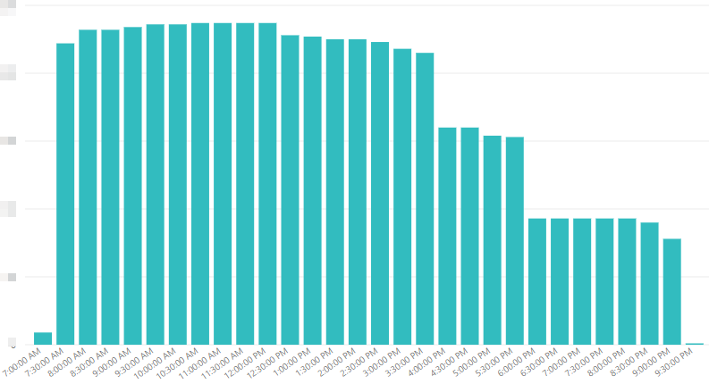
There is one roster about each nurse’s shift with a start time and a finish time per day, requester would like analyze the peak time of all the nurses and the interval period is 30 minutes in order to identify the current resources allocation.
The idea output is like below screenshot
Solution:
Firstly we need to prepare a time table with 30 minutes interval which will used as the X axis in the chart.
Create a calculated Table by using GENERATESERIES

TimeTable = GENERATESERIES(TIMEVALUE("00:00"),TIMEVALUE("23:59"),TIME(0,30,0))
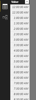
Then, we will see a time table like this
Create two measures under this table
Maxtime = MAX(TimeTable[Value])
Mintime = MIN(TimeTable[Value])
Secondly, let’s check the roster data
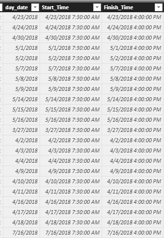
Apparently, we can’t use starttime and finishtime directly, because we need compare with time only without date.
Created two calculated columns to contain time only of start and finish by using FORMAT.
Starttime_timeonly = FORMAT(Roster[Start_Time],"hh:mm:ss")
Finishtime_timeonly = FORMAT(Roster[Finish_Time],"hh:mm:ss")
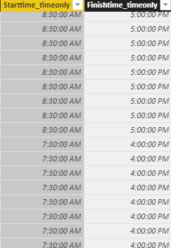
Till now, all the preparation work is done. We just need one Measure to calculate what we want, in this case we would like to know how many nurses are rostered in each 30 minutes per day.
The Measure will like this
Nursecount = CALCULATE(DISTINCTCOUNT(RosterOn[emp_id]),
				FILTER(RosterOn, and(RosterOn[Starttime_timeonly]<=[Mintime] , RosterOn[Finishtime_timeonly]>[Maxtime])))
Now that’s create the chart, please remember that there is no relationship needed between the timetable and the Roster table in the data model.
Drag the [Value] from Timetable to Axis, and the measure just created to the Value
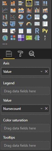
The output is exact same as we expected.
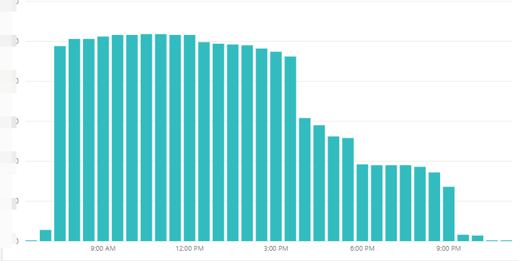
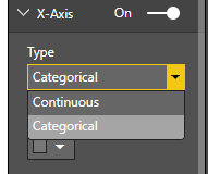
We could also change the Type of Axis to be exact the same as first screenshot at the beginning of this blog
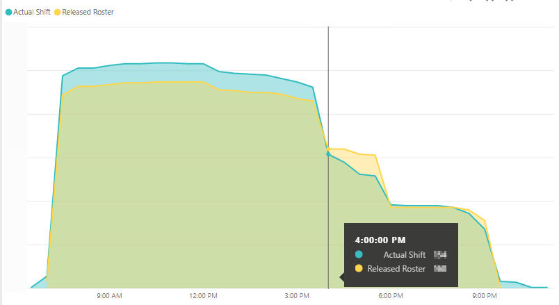
To make a comparison between Roster and Actual shift, I created a separate measure based on the same method as above with “ActualShift” table. And I personally prefer Area chart to present this type of analysis, so the final result is as below which completely show us what happened per day.
Have Fun~
Thanks Eric Dong