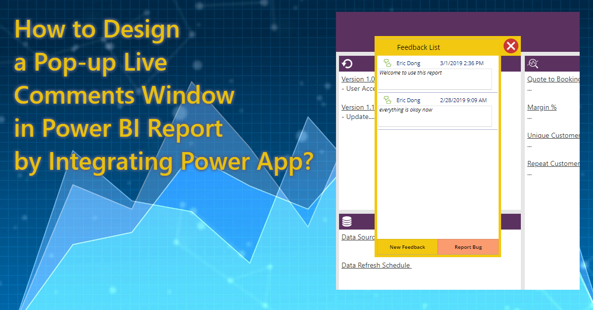
Power BI report provides a great interactive experience for the consumers, and the missing piece is the end user directly make some input within Power BI report and then the inputs will be reflected in the report, e.g comments of the report or a certain page. Adding a PowerApp as custom visual in Power BI can make this happen. Please see the sample screenshots I did as below. Once you know how to use this method, you can integrate other apps to complete complex tasks, e.g. integrate Microsoft Flow to do Self Service access request to the report based on the approval and O365 actions in MS Flow and Row Level Security in Power BI.
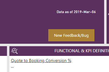
To save the space in that page, I make the PowerApp tile like a “Pop-up” window by using the bookmark feature (I will describe details later), so I just put a button in the report banner.
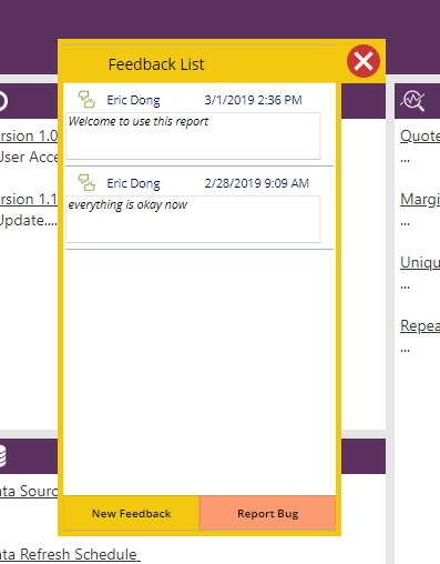
Once I click the button, the feedback window will pop up, then the consumer can interact with the Power App to create a new Feedback or report a Bug, in this case, the Feedback will directly be reflected when navigating back the Feedback list page, and the Bug will trigger an API to create a ticket in Freedcamp which I won’t introduce in this article. Click the red cross to close this “Pop-up” window.
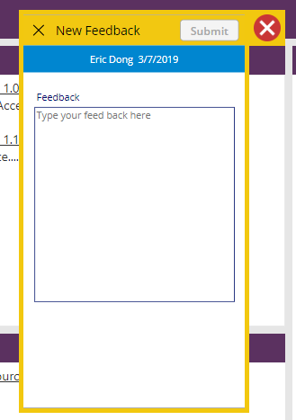
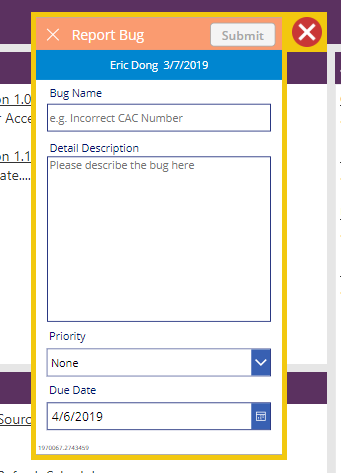
Okay, now let’s see how to design this PowerApp.
Prerequisites
- License: PowerApp is user based license like Power BI, so you and end users all should have Power App license, only you have stand alone PowerApp license won’t work, as the users need a license to “Run” your app.
- Gateway: If you’d like to directly connect to the SQL Server, then you need to make sure the Gateway is correctly setup.
PowerApp Design
PowerApp studio can be only opened on the web, so you need to start the journey from Power BI service. Edit the report you’d like to add PowerApp, add PowerApp custom visual from “Import from Marketplace”
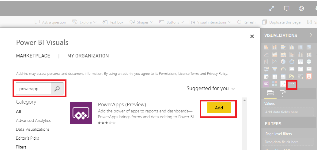
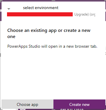
Just like normal visuals, you need to select data from your dataset, to simplify this sample, I just used on measure here as “reportid”, as I would like to consolidate all the feedback in the same place, and this reportid will be a unique identifier. So you need to create this measure in desktop and publish it before you edit the report. Select your measure then the visual will be like below screenshot, select the development environment of PowerApp based on your situation, then click “Create New”. Once you created and published this PowerApp, you can “Choose App” to reuse it in other report or modify this app by using Power BI data connection.
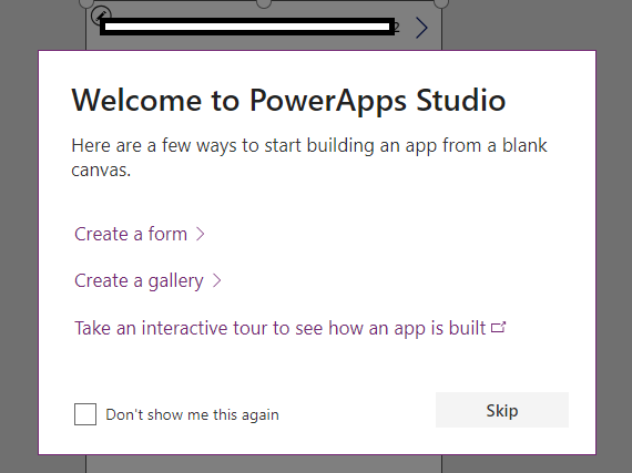
After “Create New”, it will bring you to the PowerApp studio, skip the welcome window.
As you created from Power BI, you will find the Power BI data connection is already there. The first thing we need to do is adding other data connections, in this case, I am using Google Sheet to store the feedback data. Of course, you need to create a Google Sheet first. We have one table in Google Sheet called “Feedback” and fields include “Report Name”, “Name”, “When”, “Email Address” and “Feedback”.
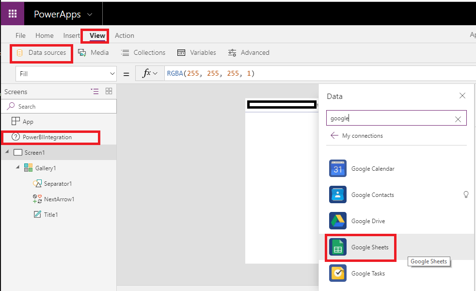
Choose dataset(spreadsheet) and then choose table(tab)
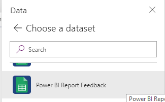
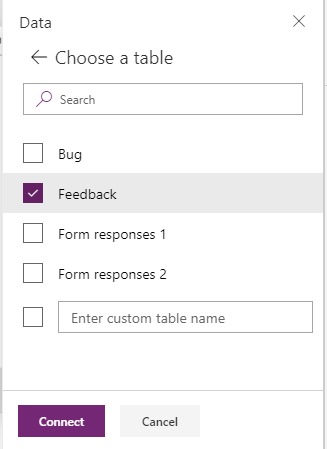
Now we have our data sources ready, then we will move to the interface design stage.
PowerApp has already created the one page for us with a gallery containing Power BI integration data (the measure you selected), though the data is only one value, PowerApp still treats it as a table and put it into a gallery. (Remember this concept, if you want to fill a single component like Label by calling Power BI data directly, it won’t work, as Power BI data is a table format instead of one single value)
Okay, we need to understand the key component in PowerApp, Gallery. My understanding Gallery is a list of records, each record includes values in a row talking about the table. When you make design a Gallery, you only need to design one record, all the others will follow the same logic and format. (P.S. I just started to learn PowerApp one week ago, so some design might not be the best practice and the term I used might not be precise.)
Let’s insert another Gallery in Screen1 with Blank Vertical and we use this screen as Feedback results display (I like to design stuff from scratch and then format in my own way, you might try other features)
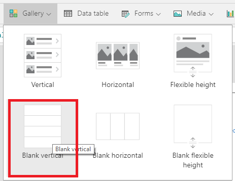
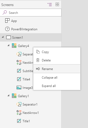
You can rename all your components for better management, especially if you have a big project. And it’s better to rename them once you added them. Because when you reference them in any expression, then if you rename them later, the expression will be broken, no dynamic change for you. I won’t rename in this sample, just make it simple.
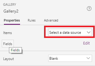
Select the newly inserted Gallery2 in screen panel on the left side, then select the source from property panel on the right side.
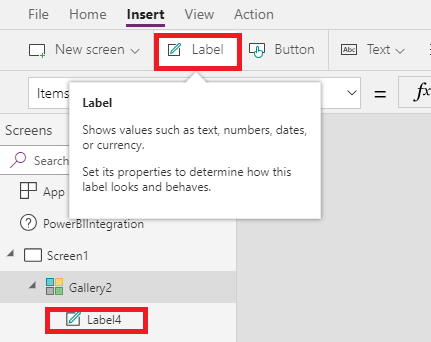
Now the Gallery is still blank, insert labels into Gallery, PowerApp studio will directly give a field value to the new label based on your spreadsheet. You can keep inserting until all the fields are added then delete the ones you don’t need or you can change expression by yourself: Thisitem.FieldName
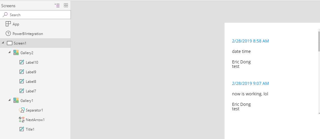
The result will be like this, you can arrange them, change color, font, size, etc. as you like
Key Step: Because we would like to reuse this app, we need to consolidate all the feedback in one place, that’s also the reason why we have input from Power BI report is “reportid”. This gallery based on current setting will display all the rows and we need to filter it to display based on the report. And we also like to sort the list based on feedback submit time Descending.
So we update the item expression like this
Sort(Filter(Feedback,Report_x0020_Name = Gallery1.Selected.Title1.Text),When,Descending)
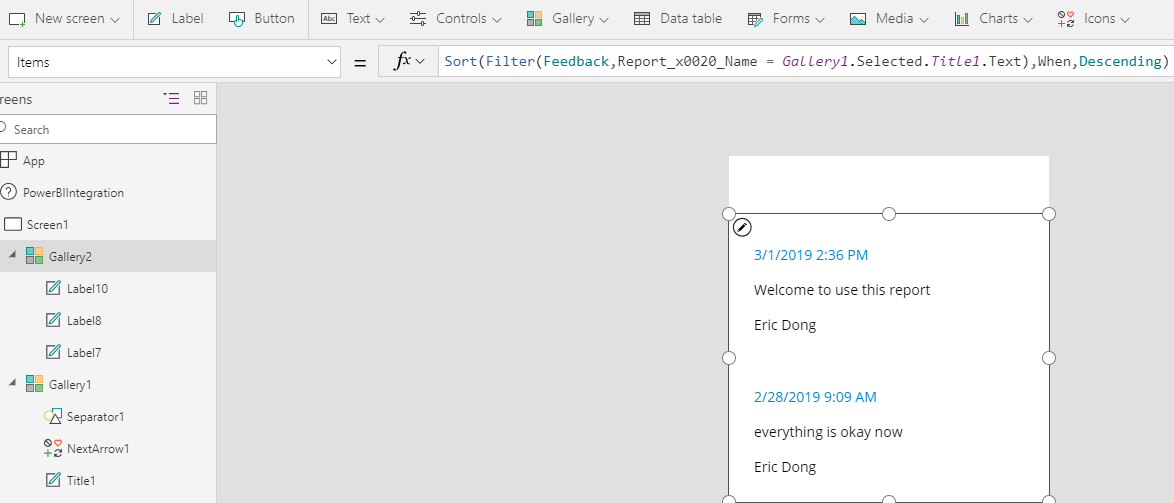
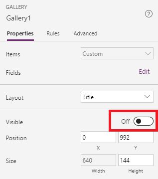
The Gallery1.Selected.Title1.Text is the Gallery automatically created in the first place and the Title1(label) contains the measure value. Because we don’t need to display Gallery1 in this screen, we could make it invisible.
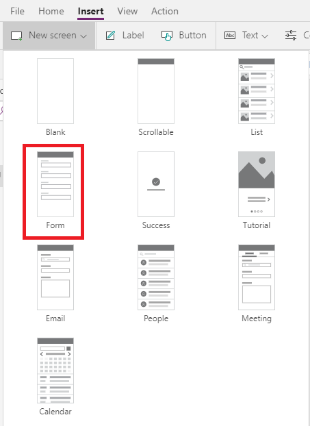
Now let’s insert another screen for data input - Submit a Feedback; Insert a Form Screen
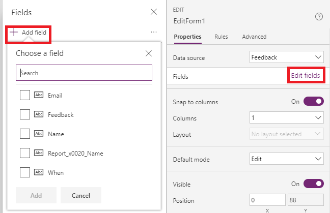
Same as the first screen, select Edit Form component, then assign the data source. The different part is we need to add fields for inputs. We will add them all.
Key Step: Some fields we can directly give default value based on login like Name, When and Email address in this case to save users’ time, the only input from the user we need is the Feedback. So we need to select the DataCardValuex in Sreen Panel (I made mistake here when I just started) and go to advanced, unlock the data. The field we are going to modify is DATA - Default.
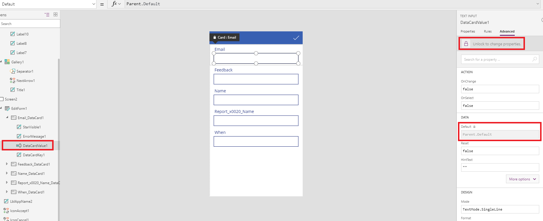
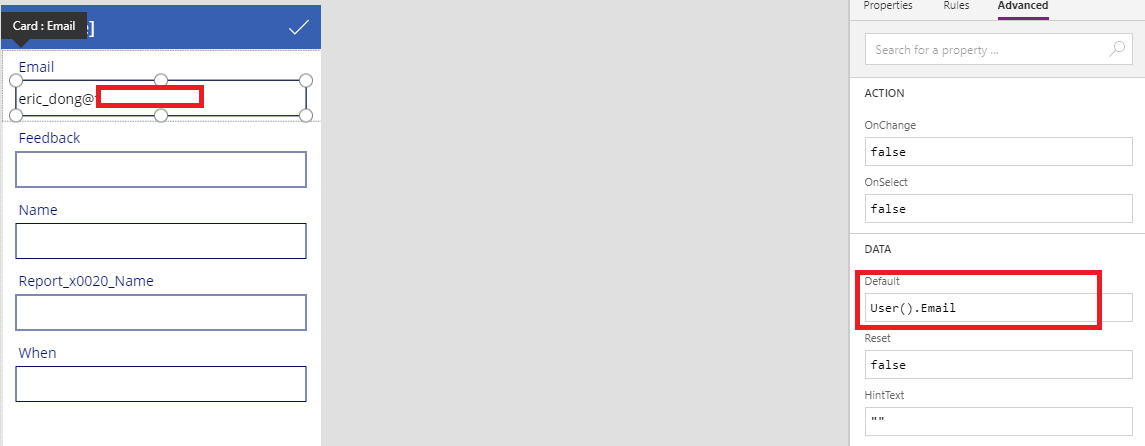
Input User().Email to get the Email address. The value will be automatically displayed in the field.
For other fields:
Name - User().FullName
When - Now()
Report Name - Gallery1.Selected.Title1.Text same as the first screen
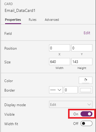
And we hide them as well.
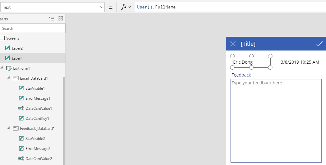
Insert two labels to present the User’s name and time (Optional), just give the end users some idea.
Now, the final step, link the screens and add functions.
Update the OnSelect attribute of Icon: the SubmitForm function is default added since we add this screen as a Form, we need to add another action here as Navigate(Screen1,Fade). You could more actions here by using ; to separate.

Back button

Go to sreen1, add an “Add” button, then update the OnSelect attribute

Advanced You can set up a field validation here to avoid empty feedback. I change the “Check” Icon to a Button, same OnSelect expression, update the DisplayMode as If(!IsBlank(DataCardValue2),DisplayMode.Edit,DisplayMode.Disabled) which means if the Feedback field is blank, we will disable the button.
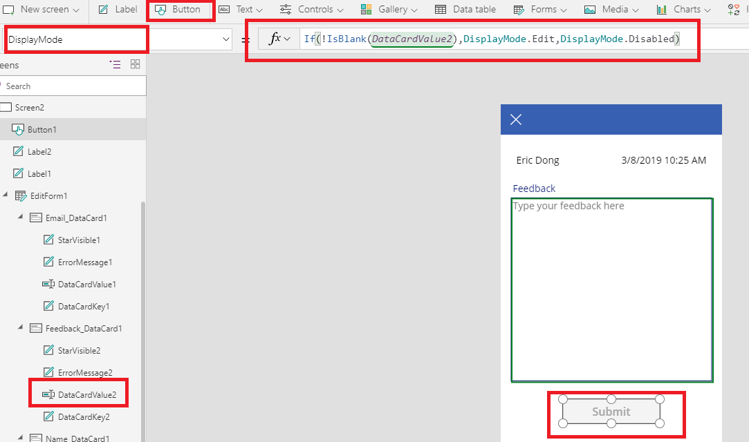
Till now, all the design about functions are all done, you could keep formatting the interface, then save and publish your PowerApp.
Pop-Up Window
The pop-up window is a trick by using Bookmark Power BI report. Now you can go back to Power BI report to add PowerApp visual just like you do in Power BI Service, and you can directly choose the app you just published. Then you need to create two bookmarks, one displays the PowerApp Visual and a Red X image and hides the “New Feedback” button, the other one is completely opposite. And then turn on the action of Rex X image and button, set the action link to the related BookMark.
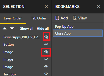
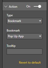
Now, when you click “New Feedback” button, the PowerApp Visual and Red X image will be displayed, the button will be hidden. And when you click the Red X, PowerApp Visual and Red X image will be hidden, the button will be displayed. Easy!
As I said at the first beginning, you can leverage the Power platform to do a lot of fun and cool stuff with Power BI. So keep exploring and I hope this step by step instruction will give you some better idea.
Thanks
Eric Dong